Before/After
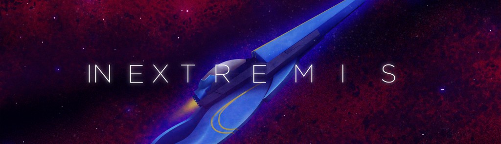
During the cycle of development of this game, one of the toughest challenges was to be recognized in gameplay terms alone; it never helped that, early one, INX looked uglier than sin on a Christmas Day. So, let’s go back in time a bit, and see the graphical evolution of the game in these past few years, to the pont it is now:
Stage 1

The 2013 early prototype version of stage 1 contained the bare minimum for that stage to work; graphical sprites for the enemies and a simple scrolling background.

Later, in this 2014 version, the distinct procedurally generated visuals of the enemies were implemented, as well as more layers, for the scrolling backgrounds; there was also a failed attempt at creating a glow effect that ended quite garish.

The current version has a far more elaborated space background (done by pixel artist Giulianno Bessa, which we’ll see more cool stuff down the line), as well as a more in-depth procedural code, that makes better shapes for larger enemies; also, notice how the graphics for the player’s ship also changed dramatically.
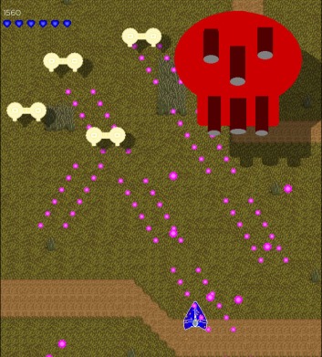
Stage 2B


Another case in which differences should be quite notable; the only thing in common between the versions are the circuitry background; the big pink foe was also revamped to have, say, a broader range of emoticon; each one representing a distinct bullet pattern, as well as numerous small pixel art animations courtesy of Giulliano.
Stage 2C

In case of stage 2C, the music one, the initial prototype art was just photos of musical instruments with googly eyes; some people loathed it, but I always found it charming.After all, the stage was inspired by Disney shorts that used the same ideas.

Charming enough to, when it come the time to make preliminary art for an expanded prototype in vector art, the eyes were maintained, and further details were added, such as bushy eyebrows.

The final version, done by illustrator Gabriel Zanini, preserve the original personality of the art, while also adding even more detail, such as monocles and mustaches. A lot of back and forth was needed to get the perfect equilibrium of personality between inanimate object and cartoon character. Also, notice that the background changed considerably; from being plain color, to a simple scrolling background, to a fully animated paintbrush effect.
Comedy & Tragedy


Another big improvement was for the bosses of stage 2C, Comedy & Tragedy; not only Zanini made a more ornate concept for the bosses venetian mask design, but the abstraction of the fight happening on a theater stage was removed, as the perspective simply did not work for the game limited resolution; instead, a more elaborated background using scrolling pages of Shakespeare First Folio was implemented.
Lady in Blue

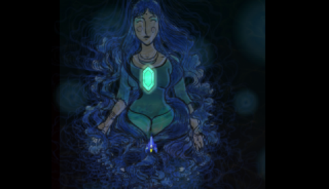
A boss that initially barely had a visual concept, The Lady in Blue passed through several iterations before, again, settling on contracting an artist. Camila Schindler, a graphical artist without experience in games, made a wonderful illustration of the concept of ethereal femininity intended by the boss, heightened further by some silhouette effects; due to its limited hitbox, the boss was expanded to fill the entire screen, rather than just a small part. Also, pay mind to the distortions in the first image; the original stage employed a distortion shader, but it was removed as it made projectiles difficult to see.
Stage 3B


This stage was a peculiar one, as the prototype art was done by Tamyres Rios, back in the beginning of development; some time later, we got back in touch, and remade the original art in a more professional way. The background have a far stronger color, as well as enemies have better animation and perspective; there are also extra details, such as the candy-coloured missiles.
Retrobot


The difference between the two images might be difficult to notice, so I’ll guide you guys through it; the original concept for stage 3B boss, Retrobot, was “bootleg megazord”; hence, the original prototype art was exactly that. Tamyres than made some modifications in that, preserving the original idea to something more Voltron-esque. The background was also changed to something that fitted the boss musical theme, an 80’s power ballad.
Stage 3C


A particularly though stage to build, the psychedelic stage 3C has a lot of potentially distracting visual elements; first, the background of colliding rectangle, meant to emulate a slitscan effect, wasn’t properly working, and was quite dull. It was changed, to a more active, but also more translucent effect that filled the entire screen. Enemies were also reworked and properly dimensioned, and bullets spewed by the flower-shaped enemies were animated.
Voluptas Mors

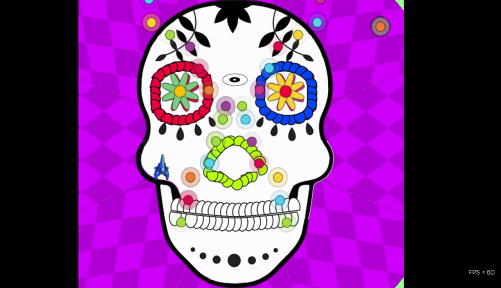
Another though boss to elaborate, thanks to its unique mechanics, Voluptas was thoroughly revamped; the bullets serving as contour were removed; a cut-out graphic to accentuate its Dia de Los Muertos original concept was added; and for further contrast, a simple kaleidoscope animations was used as background to the fight.
Venus in Furs


A playtester favourite, satge 4A boss Venus in Furs was unique in the sense it used simple hand-drawn animation to convey a grungy, dirty aesthetic; this was maintained in the final version, with unique animations for the different stages of the fight, as well as having an updated design. To convey a sense of spatial coherence, she is set on a pedestal (a collage made of newspaper classified ads for male and female prostitutes), and has a background made of scrolling exploitation movie posters.
Stage 4B
Stage 4B is the horror-themed stage; with distinct monster and creatures; so the original prototype art was basic as it gets. Shoutouts for stolen Binding of Isaac art :p

The more elaborated version came also courtesy of Gabriel Zanini; with semi-realistic renderings of the evil creatures, meant to provoke more discomfort than fear. Also note the improvised background of (supposedly) evocative shapes.

Much like Tamyres, Zanini also returned for the final version, and the skills he gained in the time between the versions do show; enemies have better shapes, color and personality, as well as animation. The backgrounds are also vastly improved, with uneven lighting, and subtle yet evocative shapes.
Stage 4C

This stage was meant to represent war and conflict, and has a design that called to mind arcade titles like Raiden and Sonic Wings. Not that can be noticed in the initial version.
A slightly improved version, with a grassy background; enemies remained crudely shaped, though.

The final version of the stage was almost entirely drawn by Giulliano, containing the enemies (which maintained the original shapes in the pixel art); and background scroll, as well as other details like explosion, bullets and destructible objects.
Fafnir


I don’t think that anything has to be said about this one. The briefing for Fafnir was essentially “a badass giant chrome dragon from straight from a Psygnosis cover“, and Giulliano did a bang-up job with it.
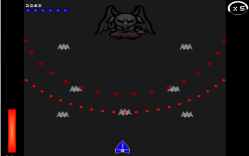
Stage 5

Finally, the final stage. Its main concept was invading a heavenly dimension of angelic guardians, represented figuratively as something that could be universally understood; the briefing contained referenced to circuit boards, islamic art, Nazca lines and sacred geometry. None of that is present in the original prototype, of course.

This more advanced 2014 version mock-up shows the intentions of the briefing; something that was dubbed by testers as “aztec high-tech”. Also notice the building in the background; in the original version, they wer scrolling dynamically, depending on the player position. This was eventually also cut for a more simple, less distracting background.

The final version was commissioned to artist Guilherme Barreiro, and he put his own spin on those concepts. Enemies now resembled more medieval stained glass windows, composed of minimalistic geometrical shapes; the arabesque fractals background also preserves the original concepts of the intersection of geometry and religion.
BONUS ROUND:
Here it is the very first prototype of In Extremis, which is almost four years old now. It contains the first two weapons, and the earliest implementations of the Drive mechanic (when it was meant to slow down time). Amazing how time flies, heh.
